Overview
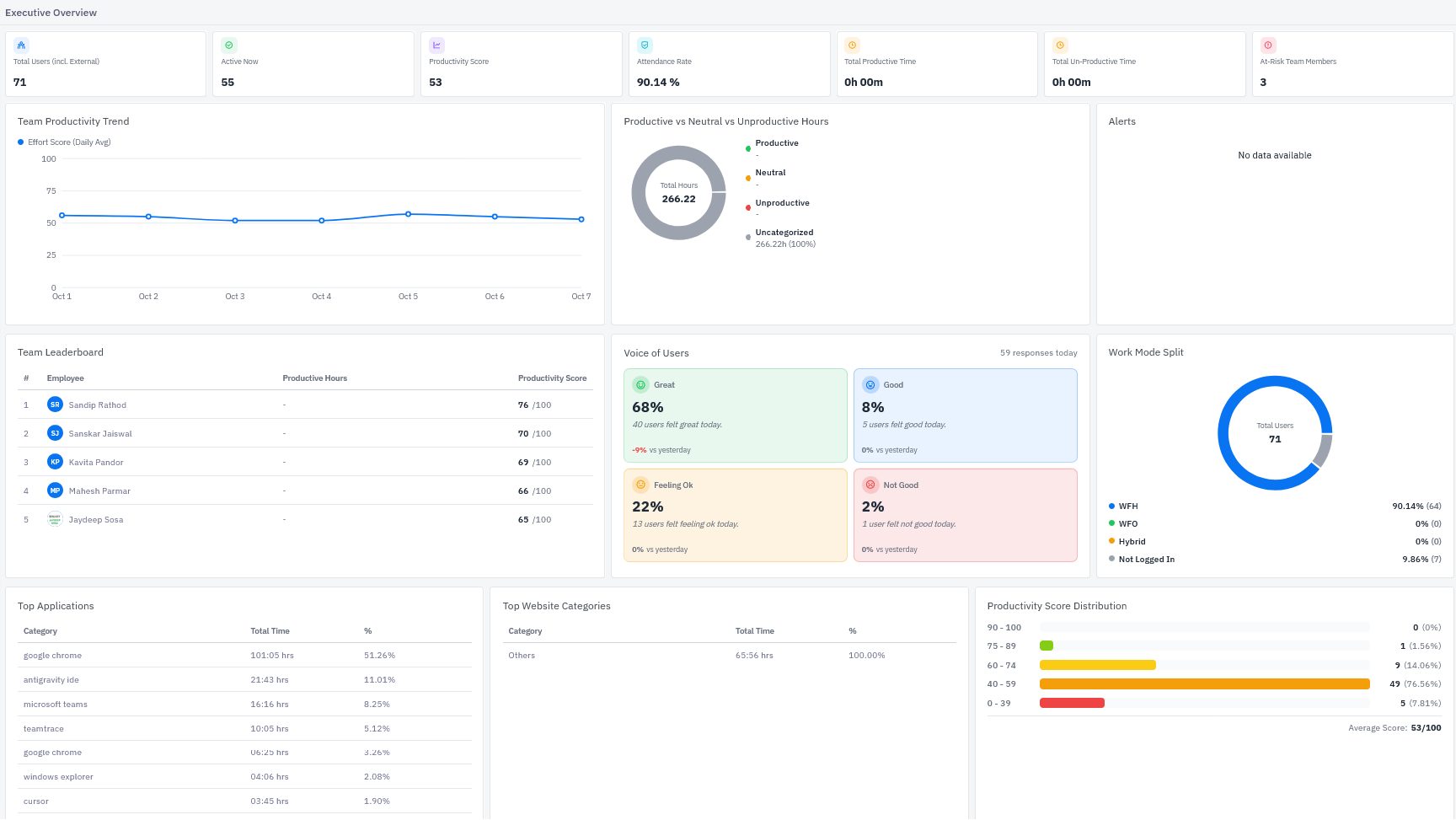
The Executive Overview is the landing page of the TeamTrace dashboard. It gives managers and leaders a single-screen view of workforce activity, productivity, attendance, and team sentiment. Use it to spot trends, see who is online, and identify team members who may need support.
The dashboard is organized into four horizontal bands, from top to bottom:
- A row of summary KPI cards
- Trend, hours breakdown, and alerts
- Leaderboard, team sentiment, and work mode
- Application, website, and score breakdowns
Accessing the dashboard
- Sign in to the TeamTrace platform with your account credentials.
- Select Dashboard from the navigation. The Executive Overview opens by default.
Note: What you see depends on your role and permissions. Users with team-level access see data for their own team only.
Summary KPI cards
The top row shows seven headline metrics at a glance.
Card | What it shows |
|---|---|
Total Users (incl. External) | The total number of users in your workspace, including external users such as contractors or guests. |
Active Now | The number of users currently active in TeamTrace. |
Productivity Score | The team's overall productivity score, on a scale of 0 to 100. |
Attendance Rate | The percentage of users who were logged in or present for the period. |
Total Productive Time | The cumulative time spent on activity classified as productive. |
Total Un-Productive Time | The cumulative time spent on activity classified as unproductive. |
At-Risk Team Members | The number of team members flagged for attention based on their recent activity or scores. |
Team Productivity Trend
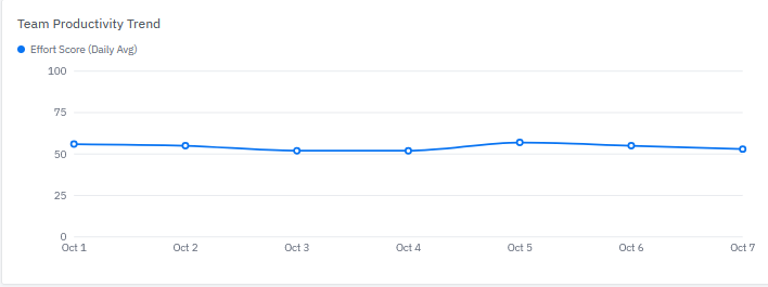
A line chart plotting the team's Effort Score (Daily Avg) across the displayed date range, with the score (0 to 100) on the vertical axis and each day on the horizontal axis.
How to use it
- Look for sustained dips or climbs rather than reacting to a single day.
- Hover over a data point to see the exact value for that day.
- A flat line indicates steady team effort. A sharp drop is a good prompt to check Alerts and At-Risk Team Members.
Productive vs Neutral vs Unproductive Hours
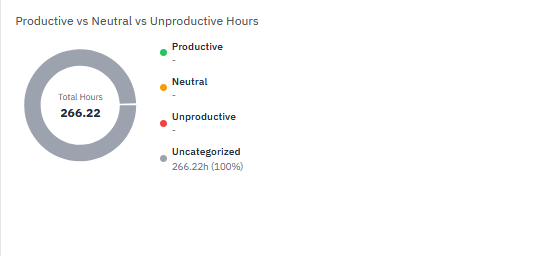
A donut chart showing how tracked time is split across four classifications. The center displays Total Hours tracked for the period.
Classification | Meaning |
|---|---|
Productive | Time spent in applications and websites classified as productive. |
Neutral | Time spent in applications and websites classified as neutral. |
Unproductive | Time spent in applications and websites classified as unproductive. |
Uncategorized | Time spent in applications and websites that have not been classified yet. |
The legend lists the hours and percentage share for each classification.
Tip: If most or all of your time appears under Uncategorized, your applications and websites have not been classified yet. Productive and unproductive totals will read zero until they are. See Troubleshooting below.
Alerts
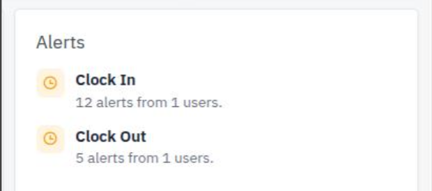
The Alerts panel lists notable events that need attention. When there is nothing to report, it displays No data available. An empty Alerts panel is a normal, healthy state.
Team Leaderboard
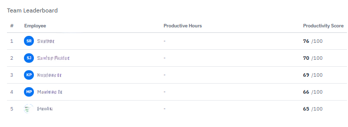
A ranked table of the top-performing team members for the period.
Column | Description |
|---|---|
# | Rank, starting at 1. |
Employee | The team member's name and avatar. |
Productive Hours | Time the member spent on productive activity. Shows a dash when no productive time has been recorded. |
Productivity Score | The member's score out of 100. |
The leaderboard shows the top five members. Use it to recognize high performers and to identify who might be able to mentor others.
Voice of Users
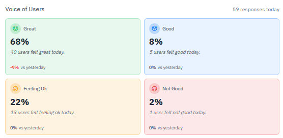
Voice of Users summarizes how team members say they feel today. The header shows the number of responses received (for example, 59 responses today).
There are four mood tiles:
- Great
- Good
- Feeling Ok
- Not Good
Each tile displays the percentage of respondents who chose that mood, the number of users behind it, and the change vs yesterday (shown in red for a decline and neutral for no change).
How to use it
- Watch the Not Good tile for early signs of low morale or burnout.
- Combine mood data with the Productivity Trend. A drop in both is a stronger signal than either alone.
- Percentages are based on responses received, not on total headcount.
Work Mode Split
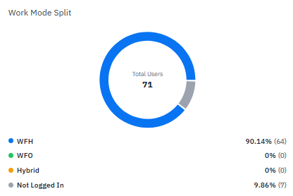
A donut chart showing how your workforce is distributed by work mode. The center shows Total Users.
Segment | Meaning |
|---|---|
WFH | Working from home |
WFO | Working from office |
Hybrid | Splitting time between home and office |
Not Logged In | Users who have not logged in for the period |
Each row shows both a percentage and a head count (for example, 90.14% (64)).
Top Applications
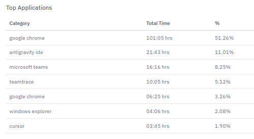
A table ranking the applications your team spends the most time in.
Column | Description |
|---|---|
Category | The application name. |
Total Time | Total hours spent across all users. |
% | Share of total tracked application time. |
Use this view to understand which tools dominate your team's day, spot unapproved software, and decide which applications to classify as productive, neutral, or unproductive.
Top Website Categories
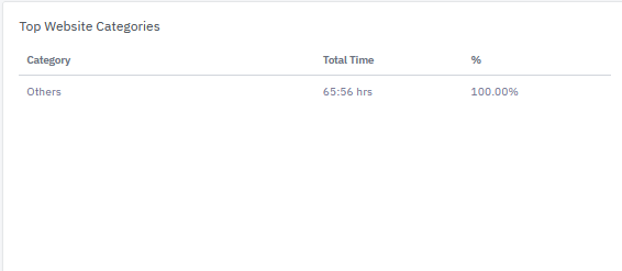
A table with the same layout as Top Applications, grouped by website category rather than by application. If websites have not been assigned to categories, they appear together under Others.
Productivity Score Distribution
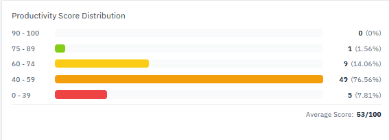
A horizontal bar chart showing how many team members fall into each score band.
Score band | Interpretation |
|---|---|
90 to 100 | Exceptional |
75 to 89 | Strong |
60 to 74 | Moderate |
40 to 59 | Needs attention |
0 to 39 | Critical |
Each band shows a head count and its percentage of the team. The Average Score appears at the bottom right.
How to use it
- A healthy distribution leans toward the upper bands.
- A heavy concentration in a middle band, with a small tail at the bottom, suggests broad, moderate performance. Focus on coaching the whole group and on the lowest band for individual support.
Common tasks
Check who is working right now. Look at Active Now in the KPI row, then compare it to Total Users.
Find team members who need support. Check At-Risk Team Members, then review the Not Good tile in Voice of Users and the lowest band in Productivity Score Distribution.
Recognize top performers. Review the Team Leaderboard at the end of each week.
Understand where time is going. Review Top Applications, Top Website Categories, and the Productive vs Neutral vs Unproductive donut together.
Troubleshooting and FAQs
Why do Total Productive Time and Total Un-Productive Time show 0h 00m? These totals depend on how applications and websites are classified. If everything is still Uncategorized, productive and unproductive time cannot be calculated. Ask an administrator to classify your most-used applications and websites.
Why does Top Website Categories show only "Others"? Websites have not been assigned to categories yet. Once categories are configured, this table breaks down by category.
Why is the Alerts panel empty? No alert conditions were triggered for the period. This is expected when nothing needs attention.
Why do the Voice of Users percentages not match my headcount? Percentages reflect only the users who responded that day. Users who did not respond are not counted.
Why is the Leaderboard "Productive Hours" column blank? Productive hours depend on activity classification. Until applications and websites are classified, this column shows a dash even though scores are still calculated.
Why does a user appear under "Not Logged In" in Work Mode Split? The user has not logged in during the period. This can be due to leave, a weekly off, or a login issue.
Was this article helpful?
That’s Great!
Thank you for your feedback
Sorry! We couldn't be helpful
Thank you for your feedback
Feedback sent
We appreciate your effort and will try to fix the article